


Ains Beauty Salon / Brand identity
Beauty, with
its own
signature.
An elegant identity for a personal approach to beauty.
We created a visual identity for Ains Beauty Salon around a distinctive serif wordmark, a sweeping curve and a quiet, considered colour palette.
Built around the line “Tailored Beauty For Every You”, the design brings together the salon’s name, personality and promise — with variations for print, digital formats and signage.
The brief
A personal service.
A distinctive presence.
The salon needed an identity that felt elegant and adaptable, reflecting its individual approach to beauty.
Our task was to give that character a recognisable form: a logo with enough presence for a salon frontage, and enough detail to make a small printed piece feel considered.
01 / The identity
A single letter.
A flowing signature.
The capital A anchors the identity.
Fine serif lettering gives the name its classical character. A sweeping curve extends around the remaining letters, adding movement and drawing the wordmark together.
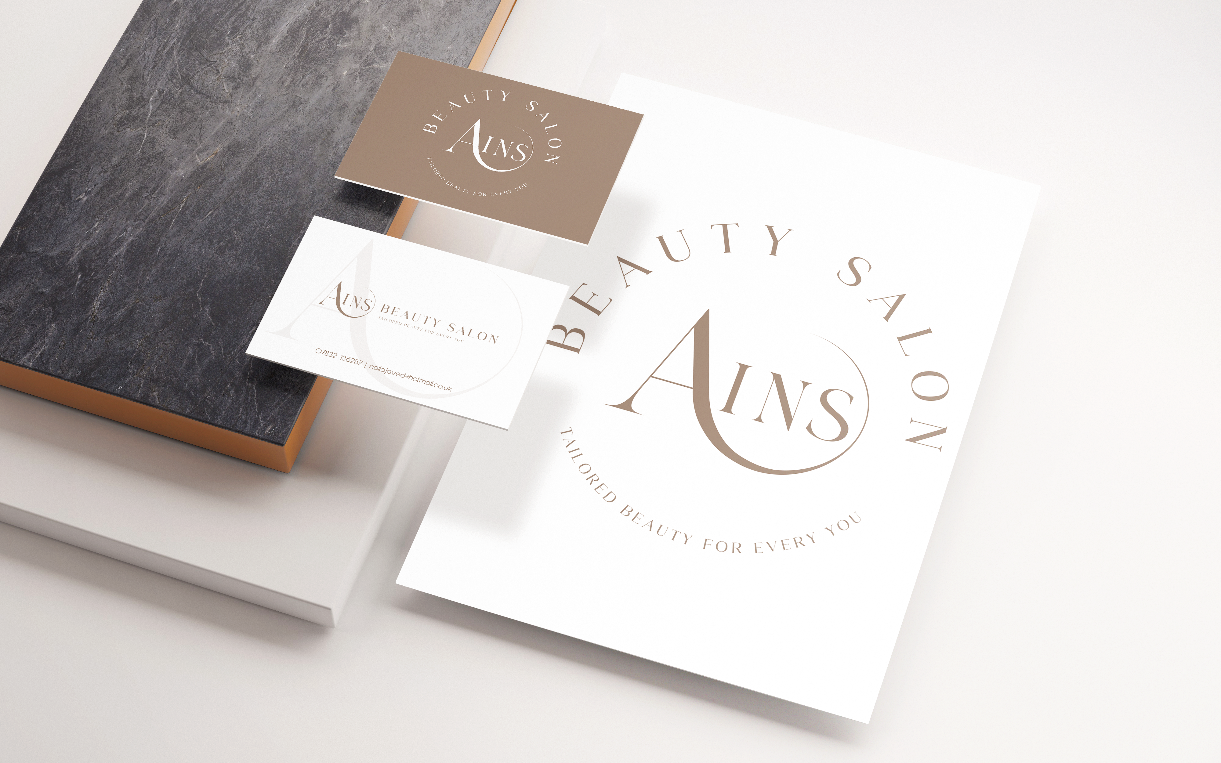
The full salon name and strapline complete the primary logo. A horizontal arrangement and a circular version provide alternatives for different spaces, while keeping the same recognisable centre.
02 / Colour & detail
Soft tones.
A clear identity.
Soft brown brings warmth, grey provides balance and white gives the fine lettering space to breathe. The restrained palette lets the shape of the logo lead.
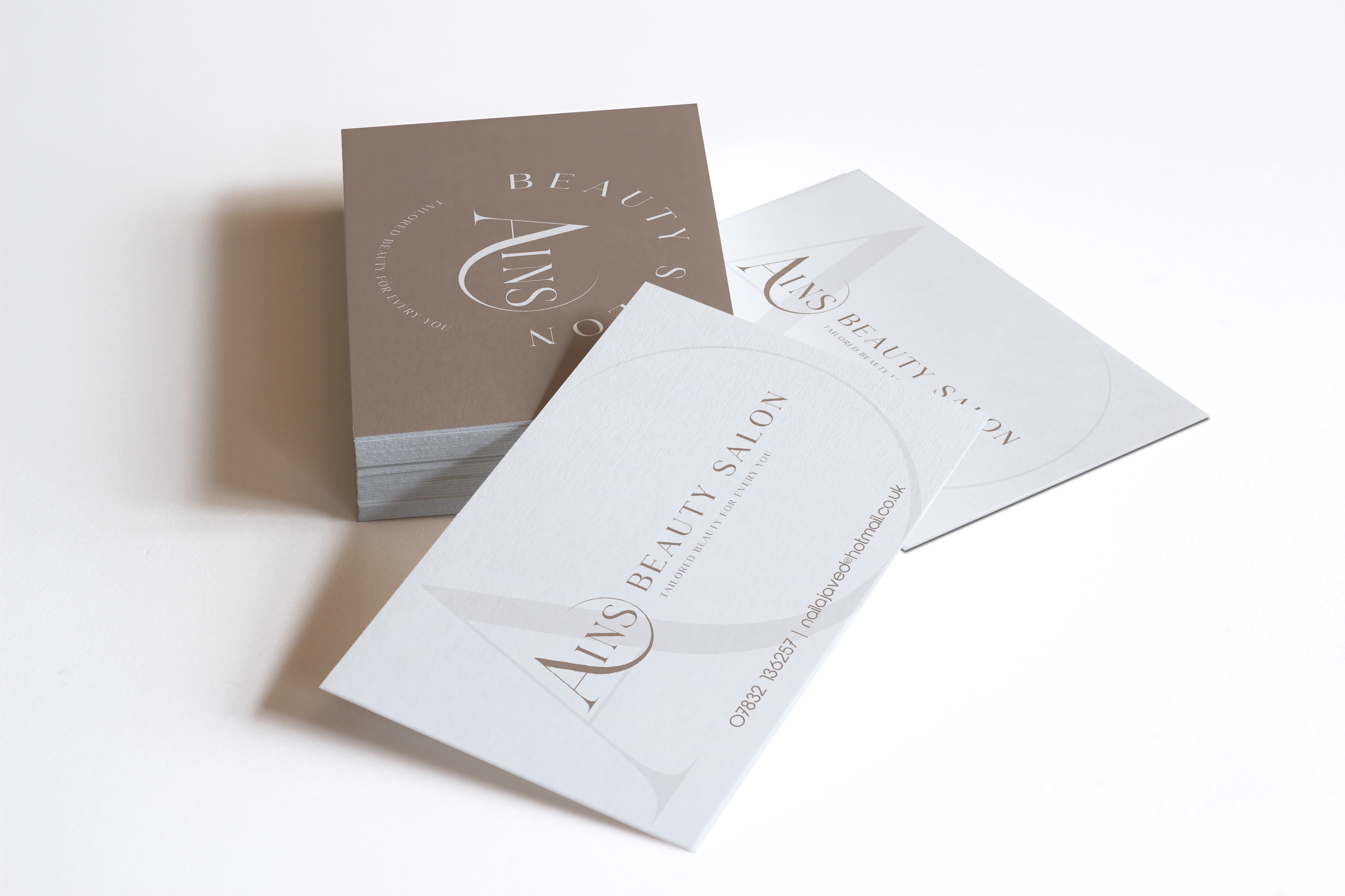
Enlarged fragments of the letterform become a subtle background detail, carrying the identity beyond the logo itself. On the business cards, circular and horizontal arrangements show how the system adapts.
03 / The identity in place
From the first card
to the front door.
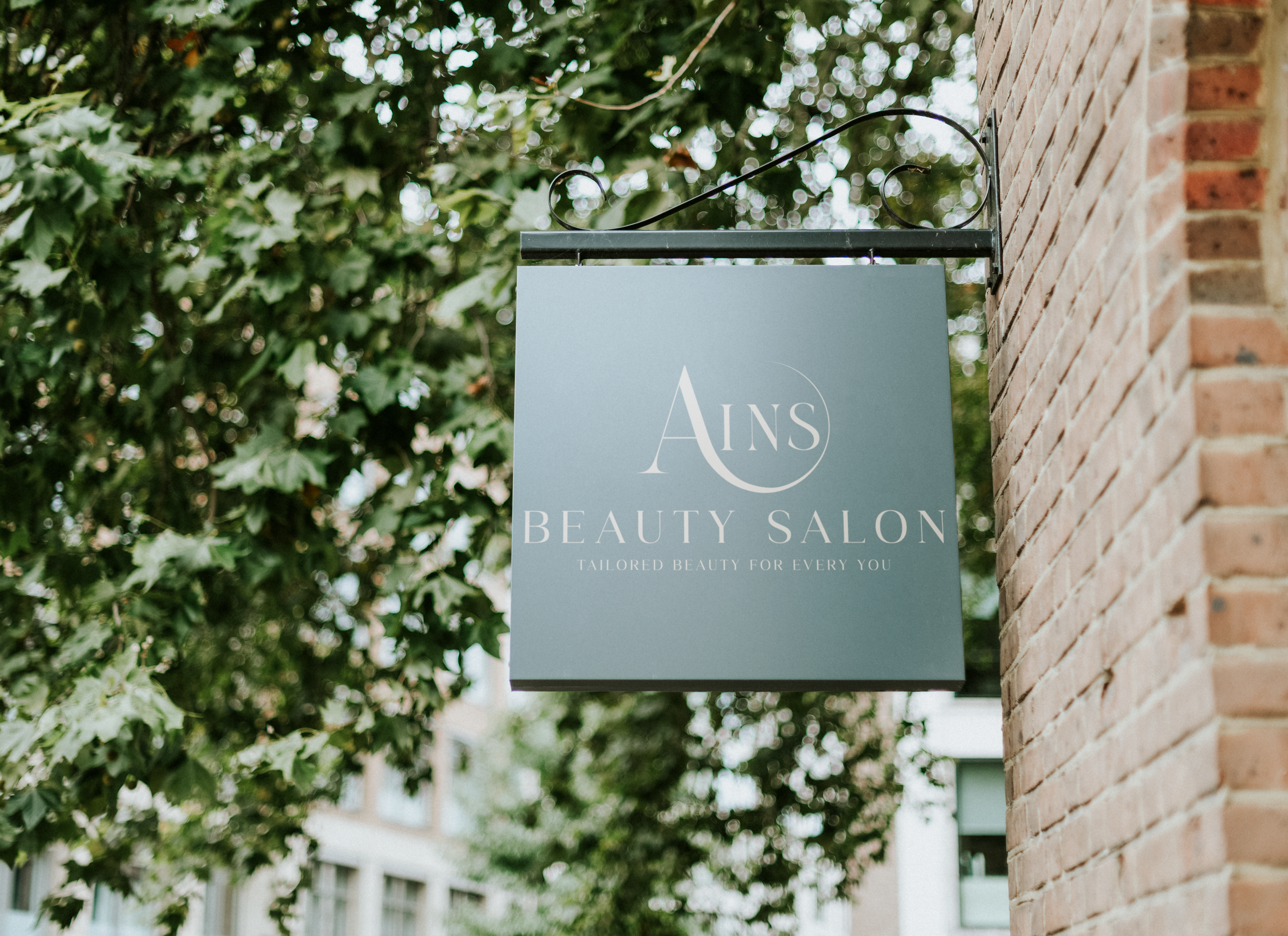
The signage presentations explore the identity at a larger scale. A hanging sign uses a light mark against a muted background, while the frontage presentation pairs dimensional lettering with a dark surface.
Each application keeps the same hierarchy: the distinctive Ains wordmark, the salon descriptor and “Tailored Beauty For Every You”.

The finished identity
One signature.
Room to adapt.
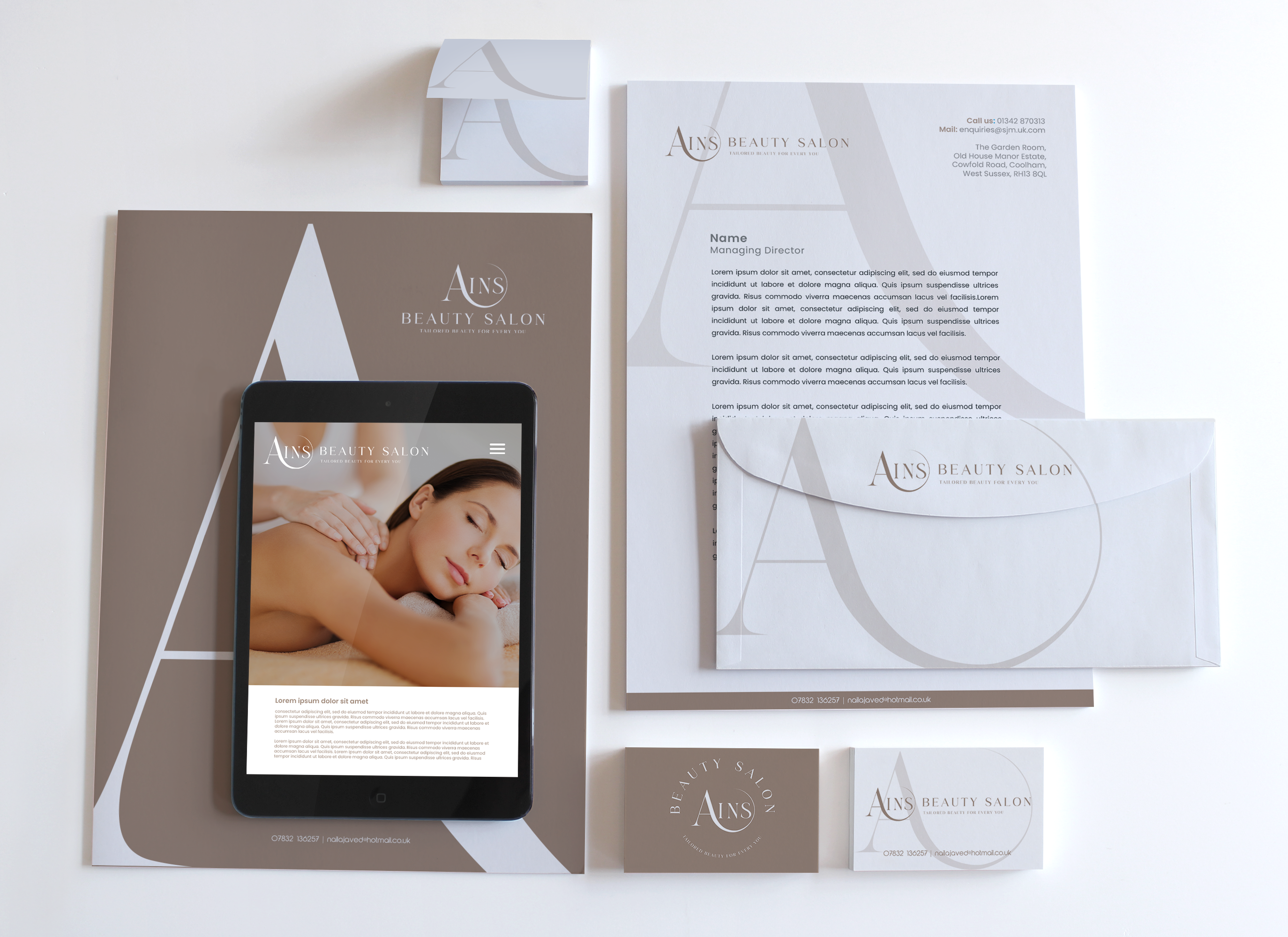
A coordinated identity with a consistent voice across stationery, digital layouts and signage.
The distinctive letterform does the work: recognisable on its own, flexible in different arrangements and supported by a calm visual language.
Your next project
A brand with
your signature?
Let’s talk.
We create distinctive identities and the materials that bring them into everyday use.
Start a conversation ↗