


Large-format print / Site hoarding / Property & construction
Big spaces.
Clear messages.
Lasting impact.
Turning a site boundary into a considered piece of brand communication.
Two independent clients. Two very different identities. One shared challenge: making large-scale graphics work across a real site, from the first impression to the individual printed panels.
Our work for Vulcan Ellis and Murray Homes brings together site hoarding design, development branding, visual presentations and large-format artwork.
Designed for the real world
A bigger canvas.
Every detail matters.
Large-format design has to work as a whole — and in the moments people pass it.
Clear hierarchy, recognisable branding and well-positioned messages give a long frontage purpose. Gates, corners, changes of level and panel joins all influence how the artwork comes together.
These projects show both sides of the work: the visual idea, and the attention needed to carry it across a physical site.
01 / Vulcan Ellis
A bold presence.
Across the frontage.
Construction branding with the confidence to be seen at scale.
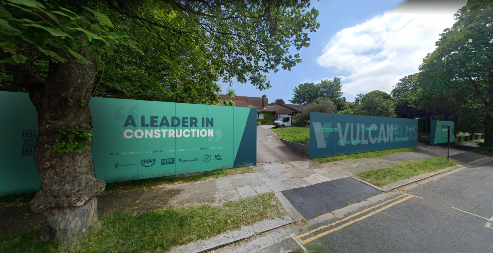
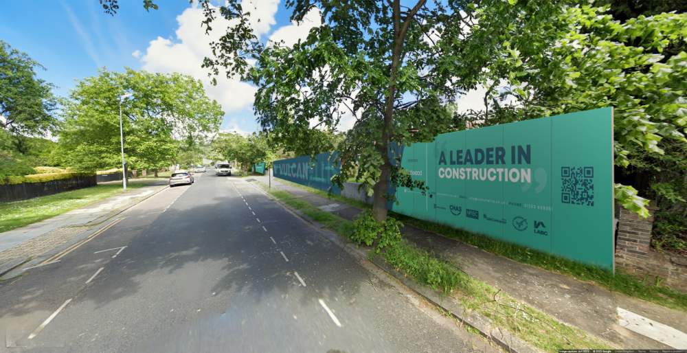
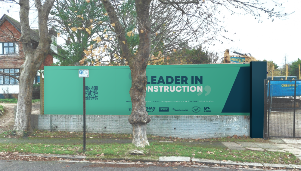
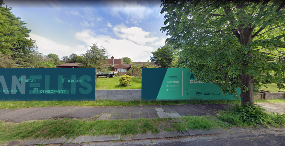
For Vulcan Ellis, we designed hoarding around a strong teal and navy palette, an oversized wordmark and the headline “A leader in construction”. The composition gave the company a consistent presence across separate sections of the boundary.
Custom sector icons, supporting credentials and contact details created further layers of information for people viewing the hoarding at closer range.
Selected work from our past relationship with Vulcan Ellis.
From the layout to the panels
One design.
Many moving parts.
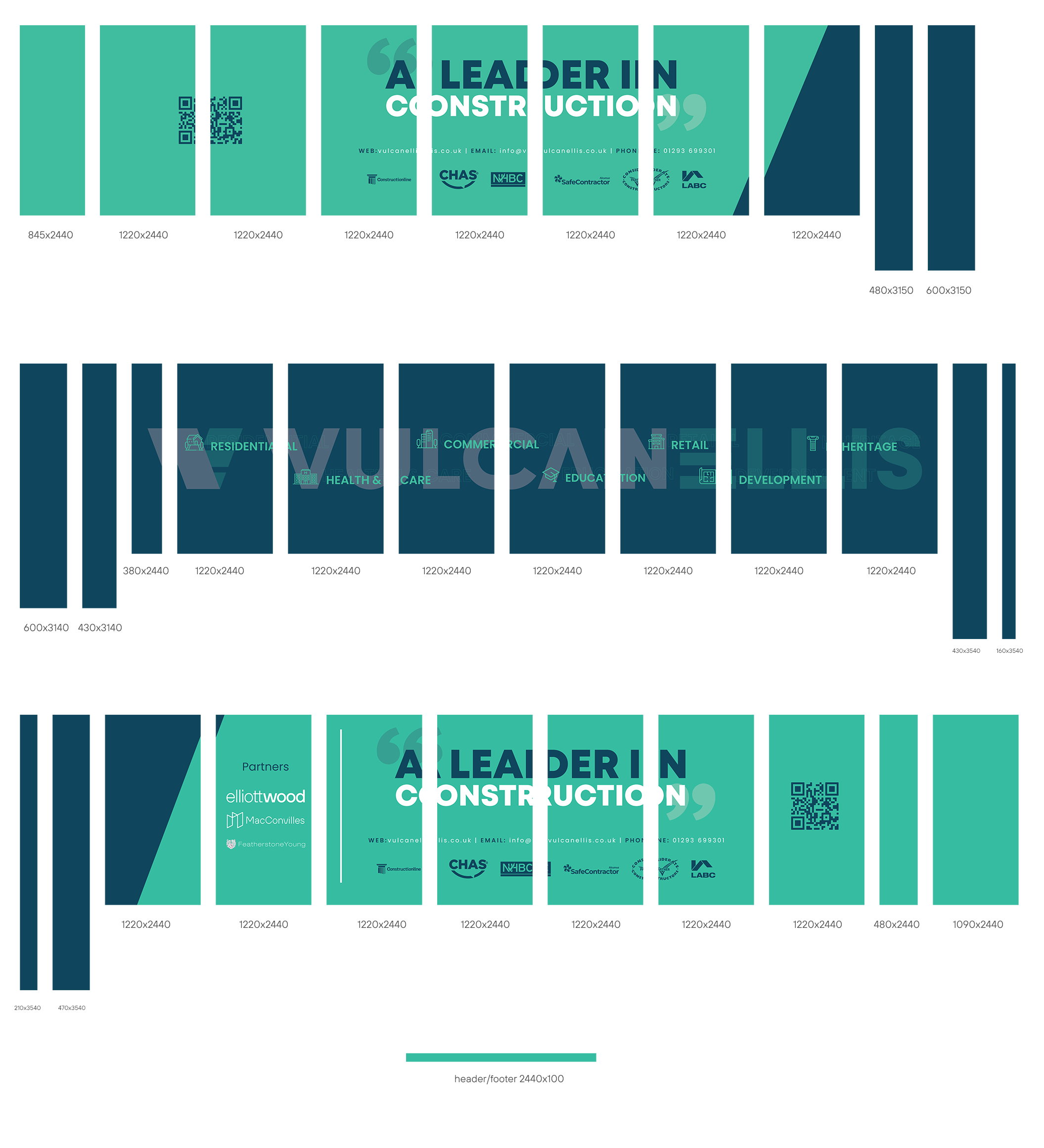
The finished frontage starts with a carefully organised artwork set.
The panel plan breaks the design into individual sections, with different widths and heights identified. It shows how the headline, wordmark and graphic shapes continue across the joins.
This is the practical side of large-format design: keeping the overall composition coherent while preparing each part for print.
02 / Murray Homes — Hazelwood
A first glimpse.
Of what is to come.
A residential development presented with a quieter kind of confidence.
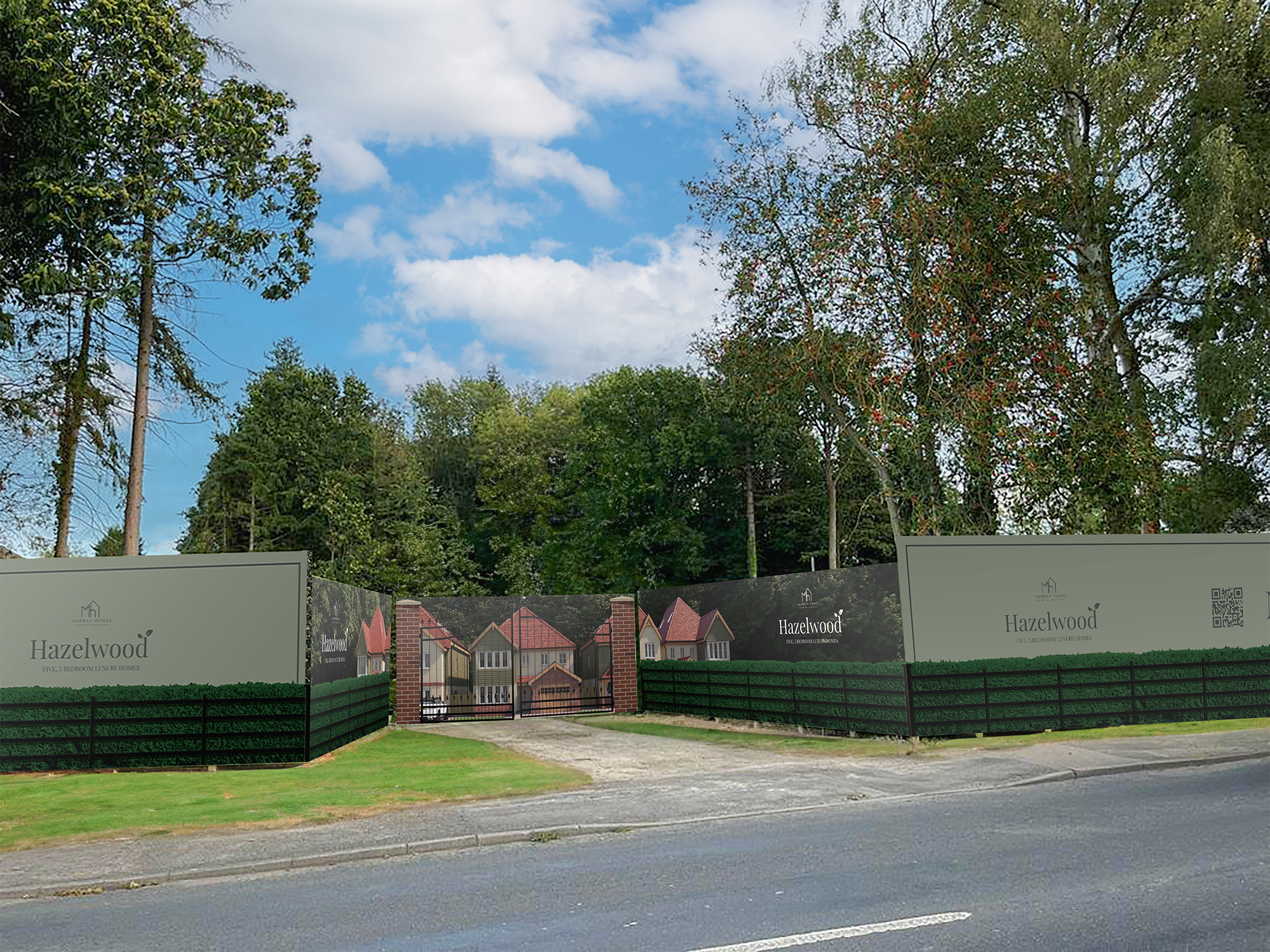
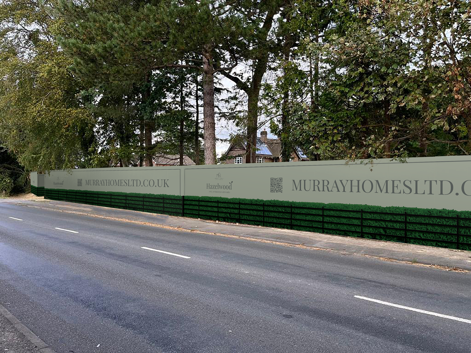
For independent property developer Murray Homes, we created the Hazelwood identity and site hoarding for a collection of five luxury homes.
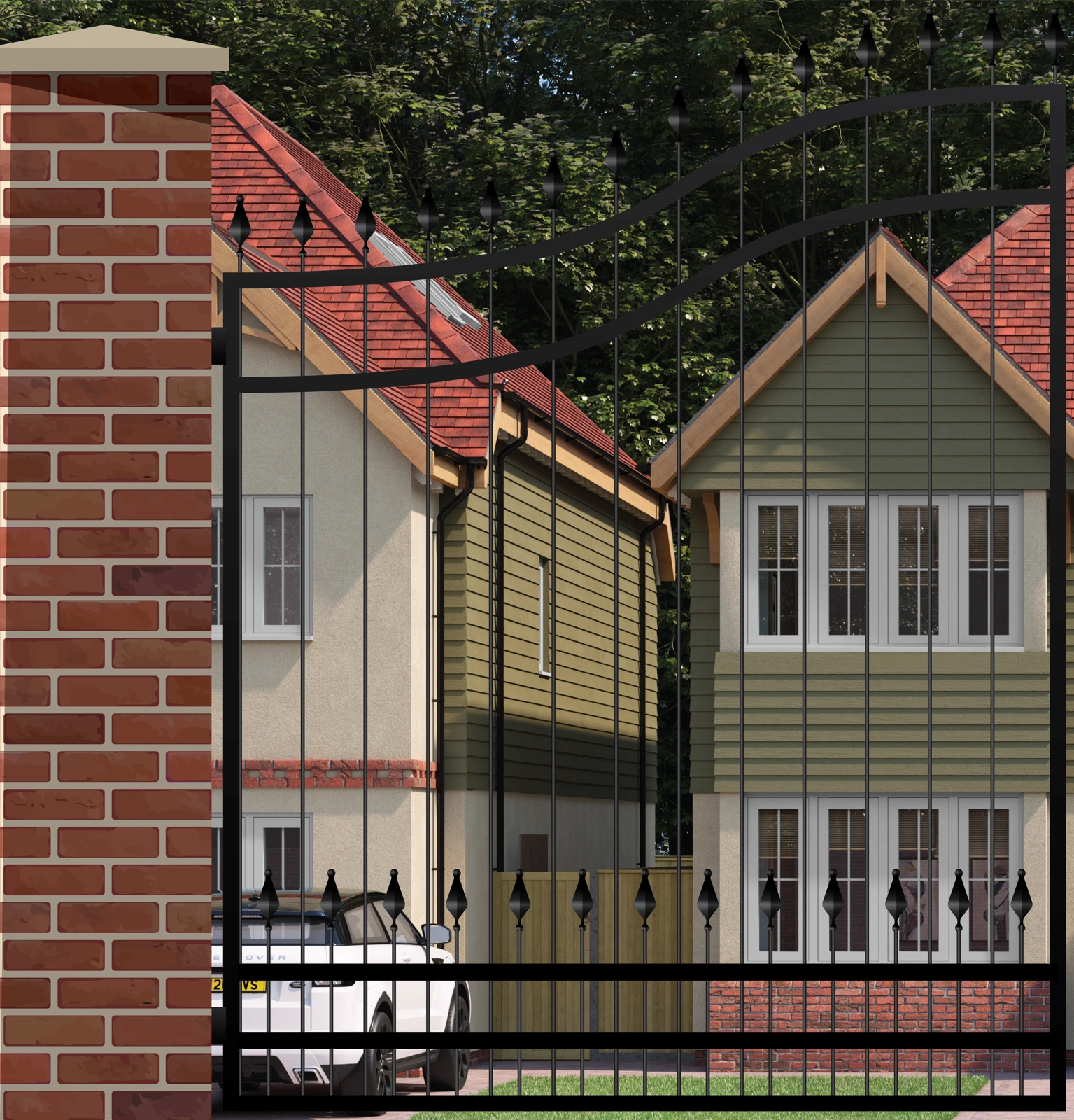
The artwork combined the development name with a continuous scene of houses, hedging, railings and an entrance gate. It gave the boundary a sense of place while introducing the development behind it.
Soft green panels, understated typography and a clear website address carried the same identity along the road.
03 / Hazelwood — the artwork in detail
See the whole picture.
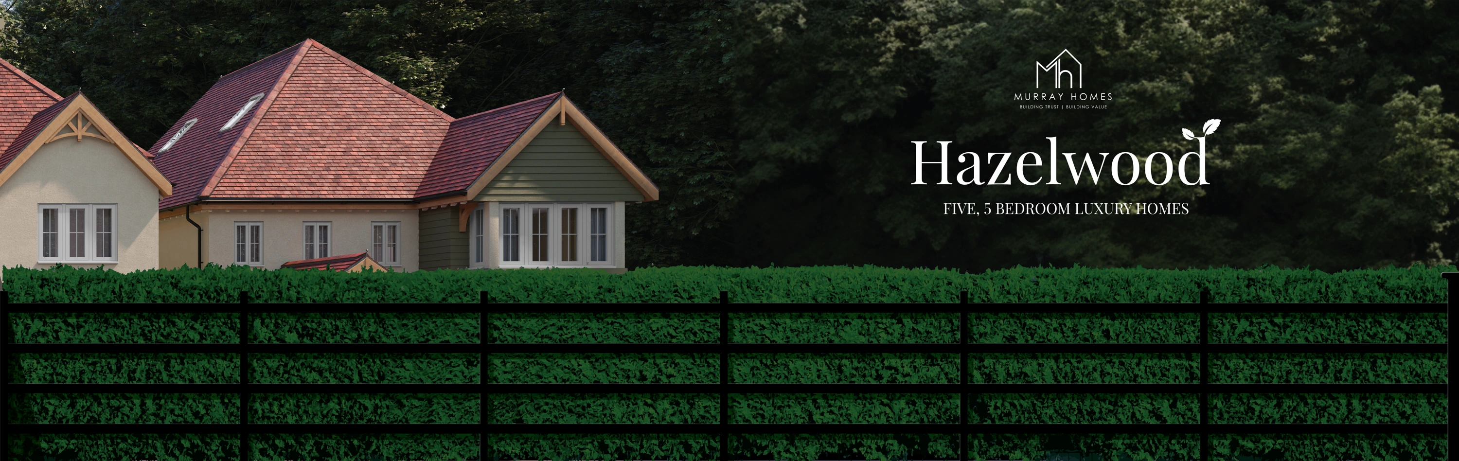
The flat artwork reveals how the scene was composed: architecture at the entrance, a continuous hedge and railing line, and quieter areas for the development identity and web address.
Select any artwork to take a closer look.


The shared discipline
Different brands.
The same attention.
A bold construction identity and a refined residential development demand different visual approaches.
What connects them is the care behind the layout: how it reads from a distance, how it follows the site and how the individual pieces form a complete presentation.
From the first visual to the prepared artwork, we help turn large spaces into clear, distinctive brand communication.
Design for distance
Strong hierarchy and readable messages that work across a long frontage.
Design for the setting
Visuals that account for entrances, street views and the character of the site.
Design for production
Carefully organised artwork, panel divisions and continuity across the print.
Your next big project
A larger canvas?
Let’s make
it count.
Site hoarding, development graphics or a substantial print project — we can help bring the whole picture together.
Start a conversation ↗