


Finch Delivery / Selected work / IMStudios
Beyond the box.
Across the
whole brand.
A delivery identity designed to travel well.
We created a visual identity for Finch Delivery that connects a compact, recognisable mark with large-scale vehicle graphics and the smaller details of everyday business.

01 / Brand identity
Two initials.
One clear mark.
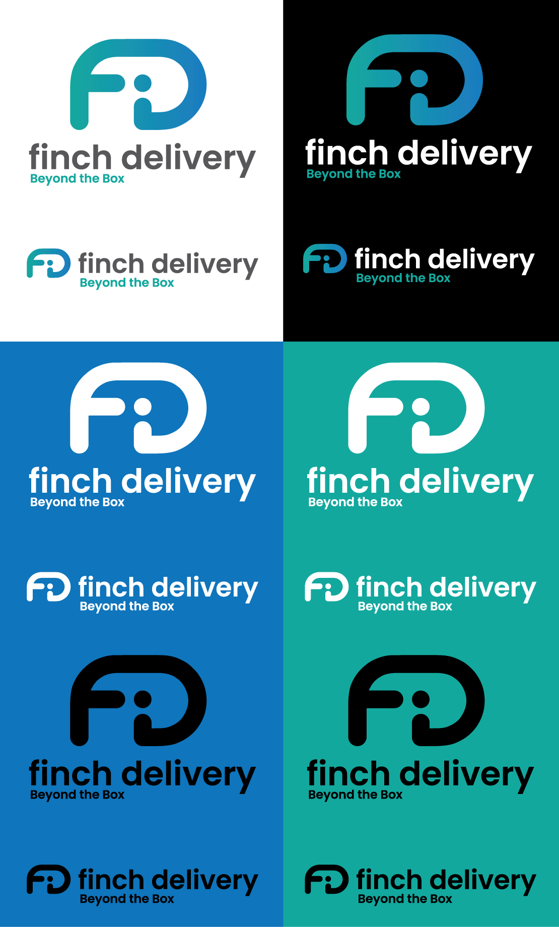
An F and a D, brought together in a compact symbol.
The Finch Delivery mark combines the company’s initials with a blue-to-teal palette. Its bold shape works as a standalone device as well as alongside the wordmark and “Beyond the Box” line.
We developed variations for light and dark backgrounds, giving the identity a consistent presence across different materials and formats.
02 / Livery design
A bigger canvas.
A stronger presence.
Taking the identity from a logo to a vehicle.
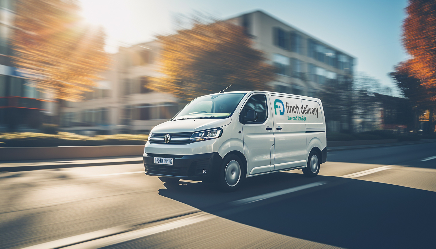
The livery uses the scale of the truck to give the Finch symbol real presence. Geometric shapes carry the blue and teal palette along the body, connecting the cab and trailer within one composition.
The vehicle visualisations show how the identity can work on the road, with the same design language adapted to different delivery formats.
03 / Brand applications
From the fleet
to the front line.
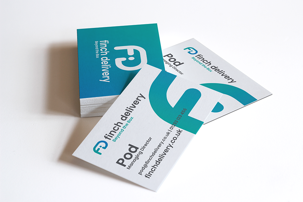
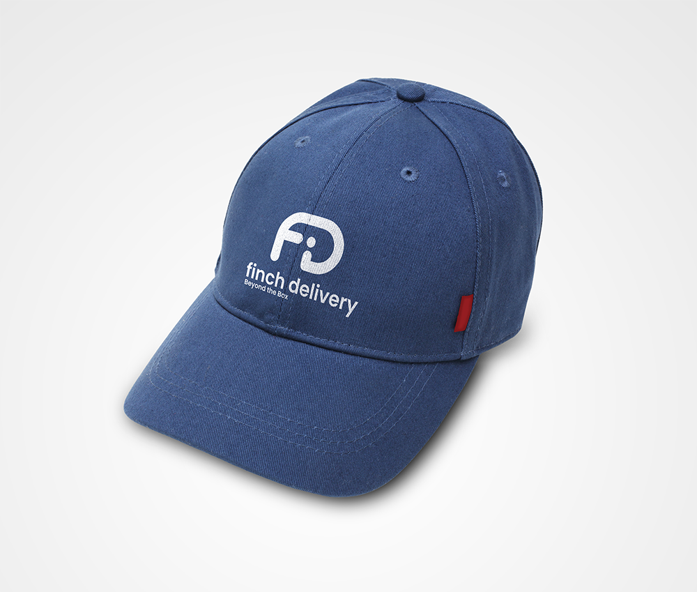
The identity extends to the people and materials representing the business. Business cards, cap branding and uniform visualisations show how a single mark can stay recognisable across very different applications.
Each piece is presented here as design work and a brand application mockup.

Your next project
Make your business
look the part.
Branding, websites and print, designed to work together.
Start a conversation ↗